Orientation: What Should I Do?
- Group navigation options to facilitate page scanning.
- Place groups of navigation options consistently on each page. For example, you might place primary navigation in the left-hand side of the page, but place navigation specific to a site section at the upper portion of the content area.
- Provide feedback on a user’s location within the site. One way of doing this is by using "breadcrumbs," or a horizontal list at the top of a page that shows the user’s location within the site hierarchy.
- For complex sites, make a site map available. A site map can be as simple as an outline representation of the site’s structure.
Orientation: Why Should I Do It?
Users want to feel like they are in control and know where they are going. If they become disoriented, they may get frustrated. Consistent and clear placement of navigation options facilitates a sense of orientation. A site map provides orientation help if users get lost; location feedback helps with this as well.
Orientation: Example
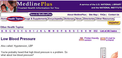
On this page from MedlinePlus, note how Health Topics in the top navigation bar is highlighted to show the current location. The top and top-right navigation areas are consistent from page to page inside the site. The top-right navigation comprises secondary information: administrative and help services (such as the site map). The top navigation, which is more prominent, shows the main content categories.
Quick Access to Important Content: What Should I Do?
- Enable access to the home page from every other page on the site.
- Place links to all major site sections directly on the home page.
- Place more important navigation options first in a group.
- For critical information, provide more than one link on the home page.
- Do not disable the Back button (for example, in a pop-up window).
Quick Access to Important Content: Why Should I Do It?
Users don't want to spend too much time figuring out where things are on your site, so the most important information should be immediately accessible. However, remember that it's just as important to help users recover from mistakes as it is to prevent them. The home page is your site's home base, so users should always be able to get back to it and reorient themselves.
Quick Access to Important Content: Example
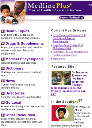
On the left-hand navigation group for Medline Plus, Health Topics is first (start here!), and Other Resources last in the list.
Predictability of Links: What Should I Do?
- Use color or some other means to designate links that have been clicked.
- Match link names with titles of the linked pages; the names and titles should be clearly and specifically named.
- Indicate when links will take users to another site or open external pages in a new window.
- Make it easy to tell what is clickable on a page. You don’t want users to be constantly passing the mouse over images, wondering if they are actually links.
Predictability of Links: Why Should I Do It?
Clicking a link changes the user's environment. Winding up in an unexpected location is not only disorienting, it can take up the user's time because the new page has to load. For this reason, it's important to clarify what links look like, where they lead to, and if that path has already been traveled.
Predictability of Links: Example
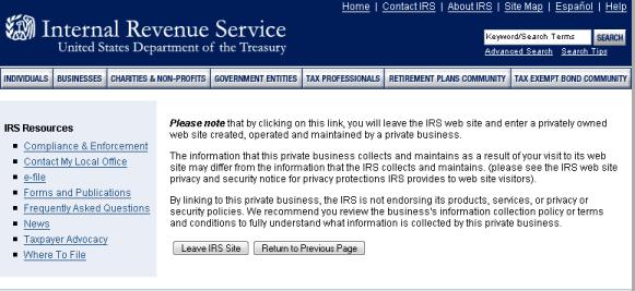
The IRS Web site links to outside companies that provide free access to tax filing software for people that make under a certain amount per year. When a user clicks to access one of those sites, the IRS clarifies that the user is leaving the IRS site and going to another location.
Search: What Should I Do?
- If your site has a search box, make it available from every page.
- Ensure that search results are easy to scan.
Some guidelines for results:- Users should be reminded of what they searched for.
- Results should have enough description to enable users to predict if the page will be relevant. Highlighting search terms in page descriptions is useful; make sure to include the page's title.
- It should be clear how the results are ordered, particularly if they are not ordered by relevance (for example, by date, by author name, and so on).
- The total number of results should be listed, as well as the number of results per page.
- It should be easy to page between results.
- It can be helpful to number results.
Search: Why Should I Do It?
Search features can help users find specific information very quickly. However, if users can't tell which results will actually be helpful, they can end up spending a lot of time looking through the results and rejecting pages that don't fulfill their needs.
Search: Examples
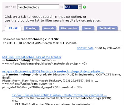
The search feature for the National Science Foundation enables filtering of results for different topic areas (the tabs) or filtering by different areas of the NSF (the drop-down list). You can also arrange the results by date as well as by relevance. The search term is bold in the content excerpt for each page.
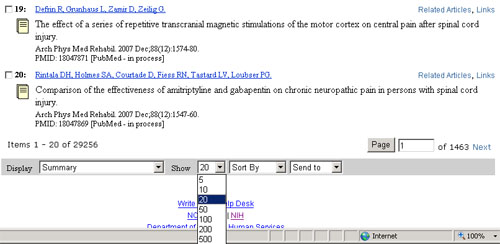
PubMed search numbers results. Users can decide how many results to show per page (helpful for large results sets).
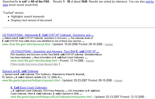
The search for the Food and Drug Administration shows when results were last updated and when they were originally posted, so that users can focus on more recent content. This implementation also enables use of a cached version of the results (and explains what "cached" means in this context).